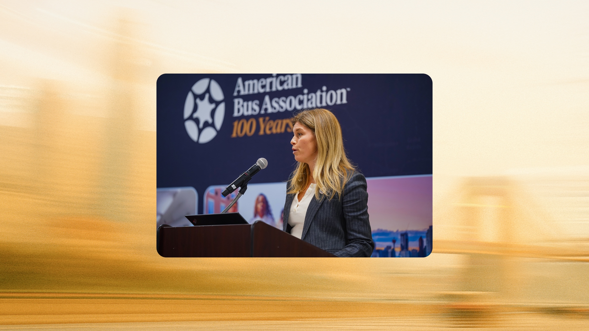
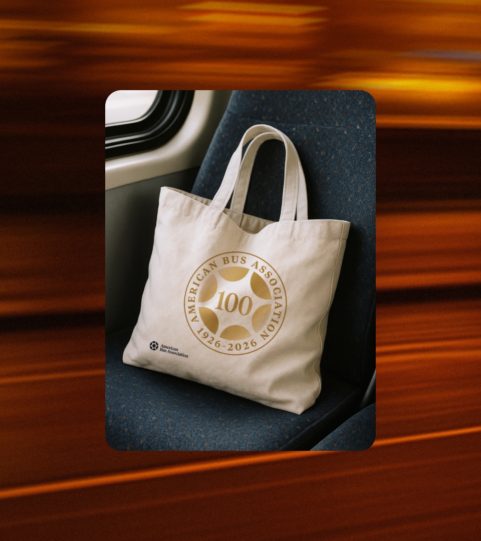
Ahead of its centennial celebration, we partnered closely with the American Bus Association to clarify their brand and unify the group travel industry. Together, we shaped a cohesive identity that is designed to support the Association's vibrant community for the next 100 years.
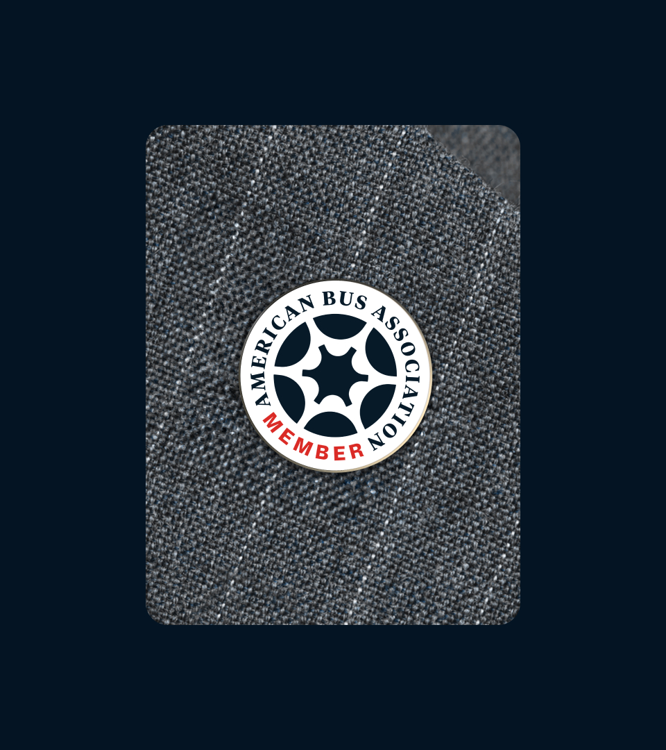
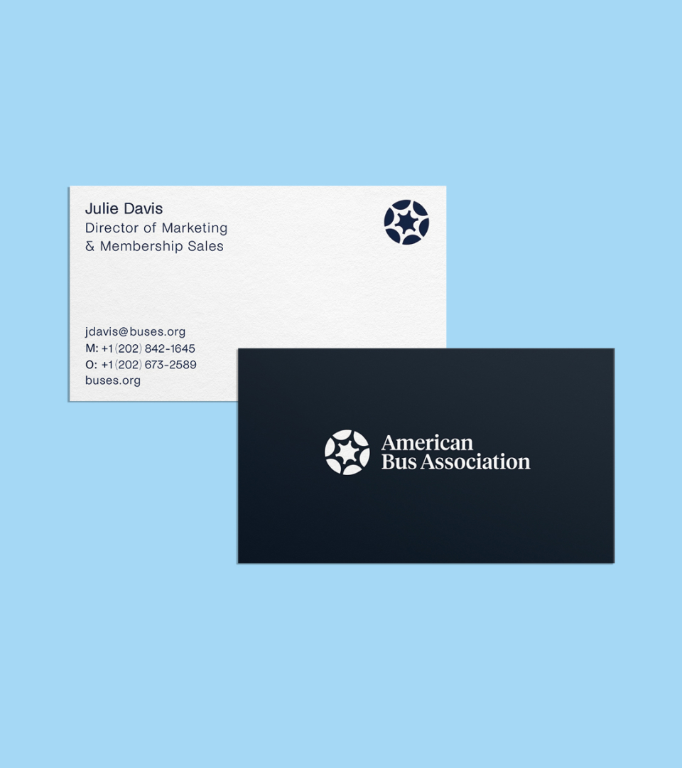
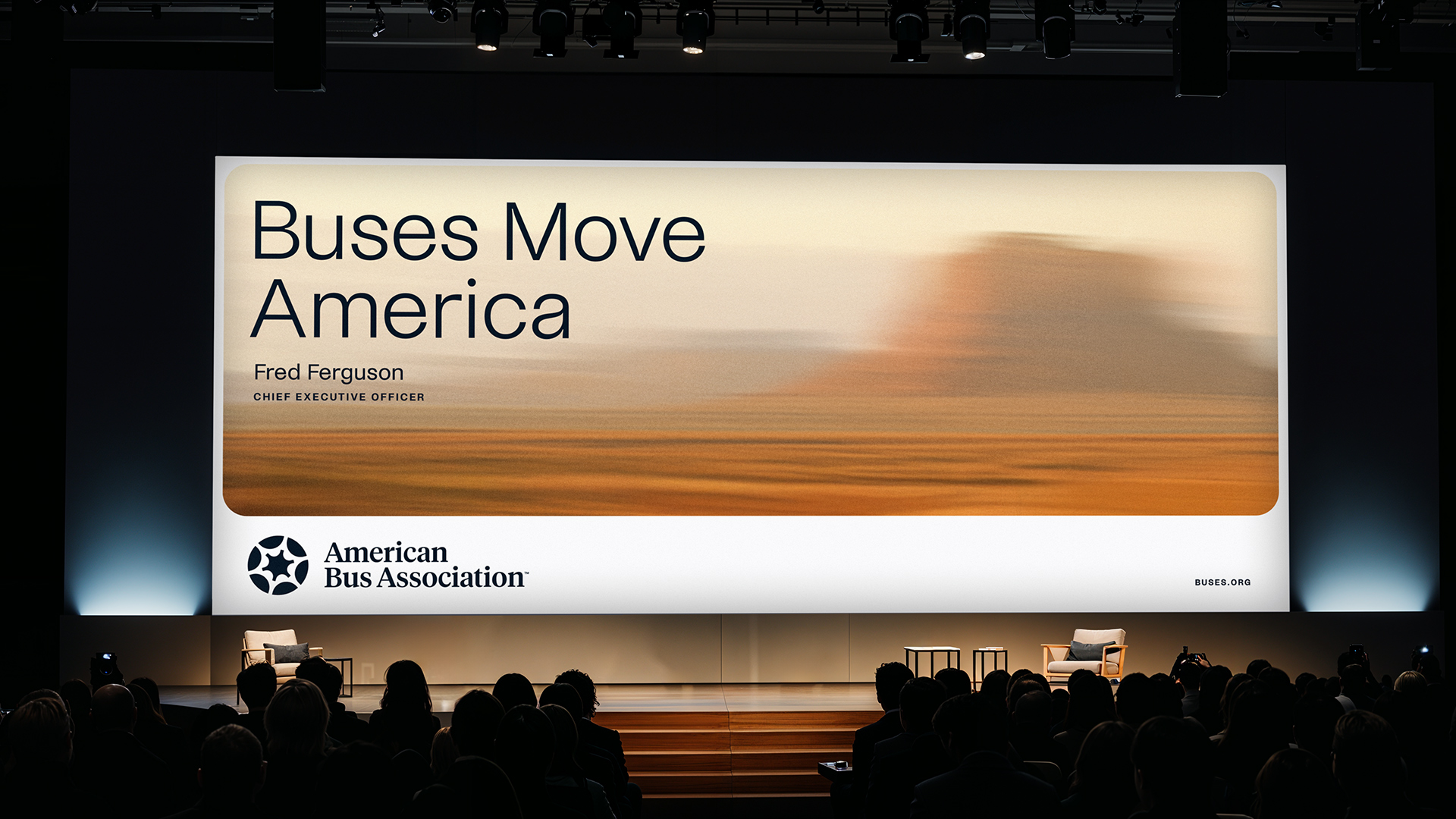
At the core of the identity is a modular logo architecture that provides a consistent foundation for a complex network of councils and initiatives. The Hub mark establishes a central symbol of connection and movement, while the serif wordmark anchors the system in authority.
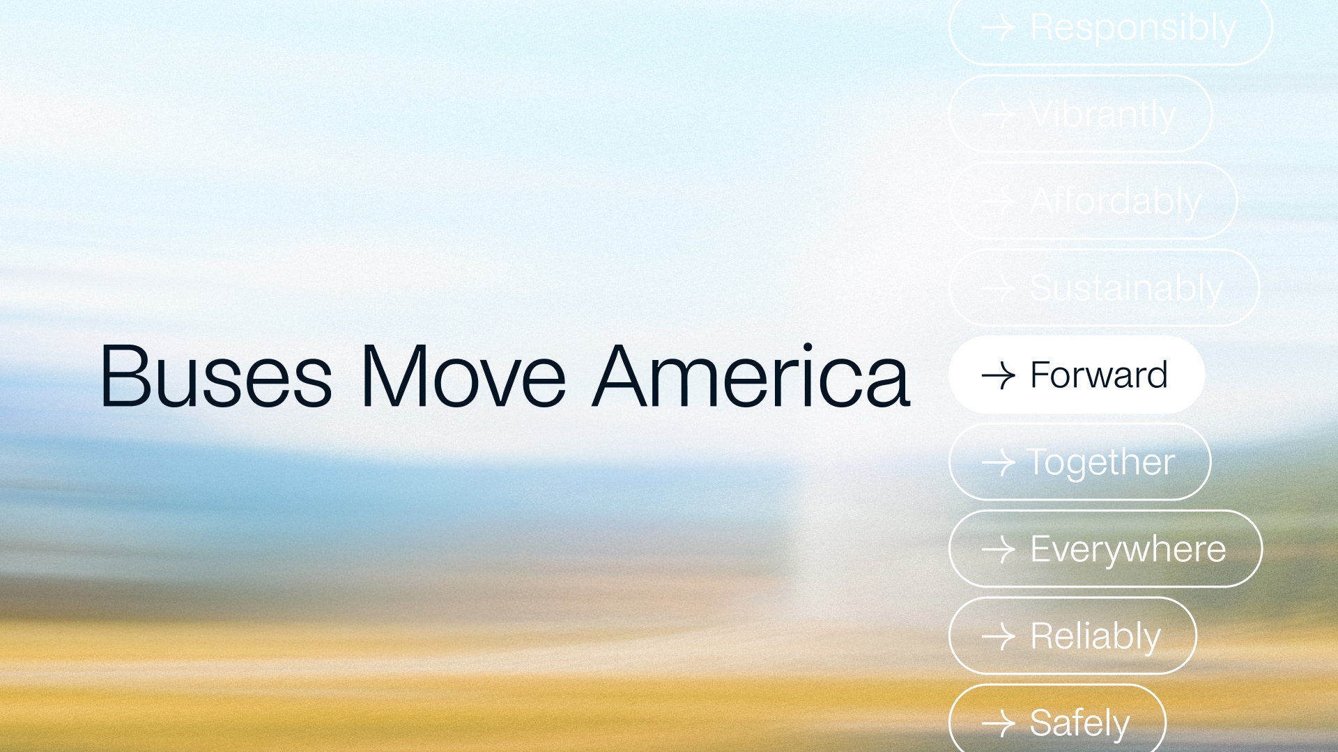
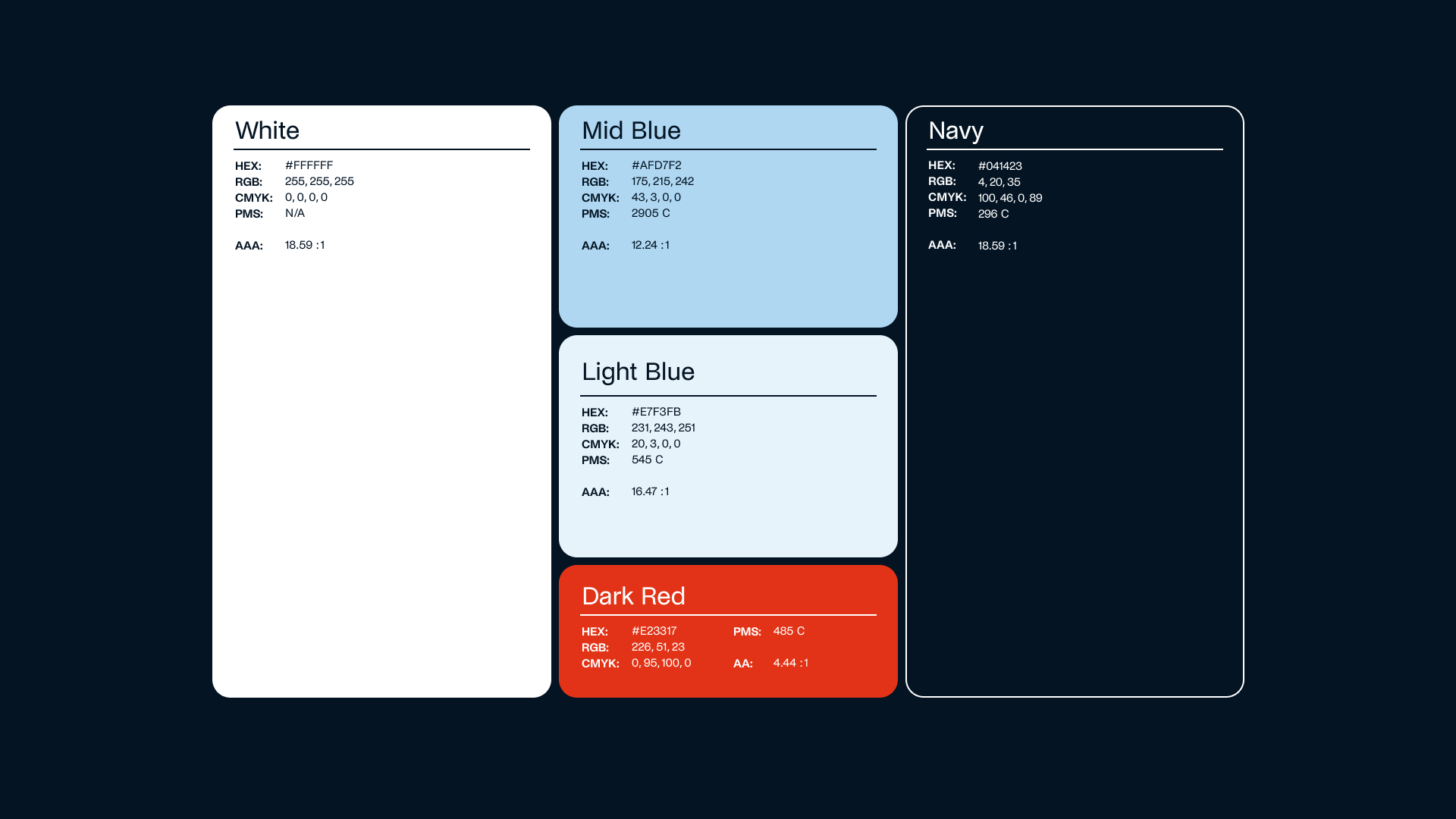
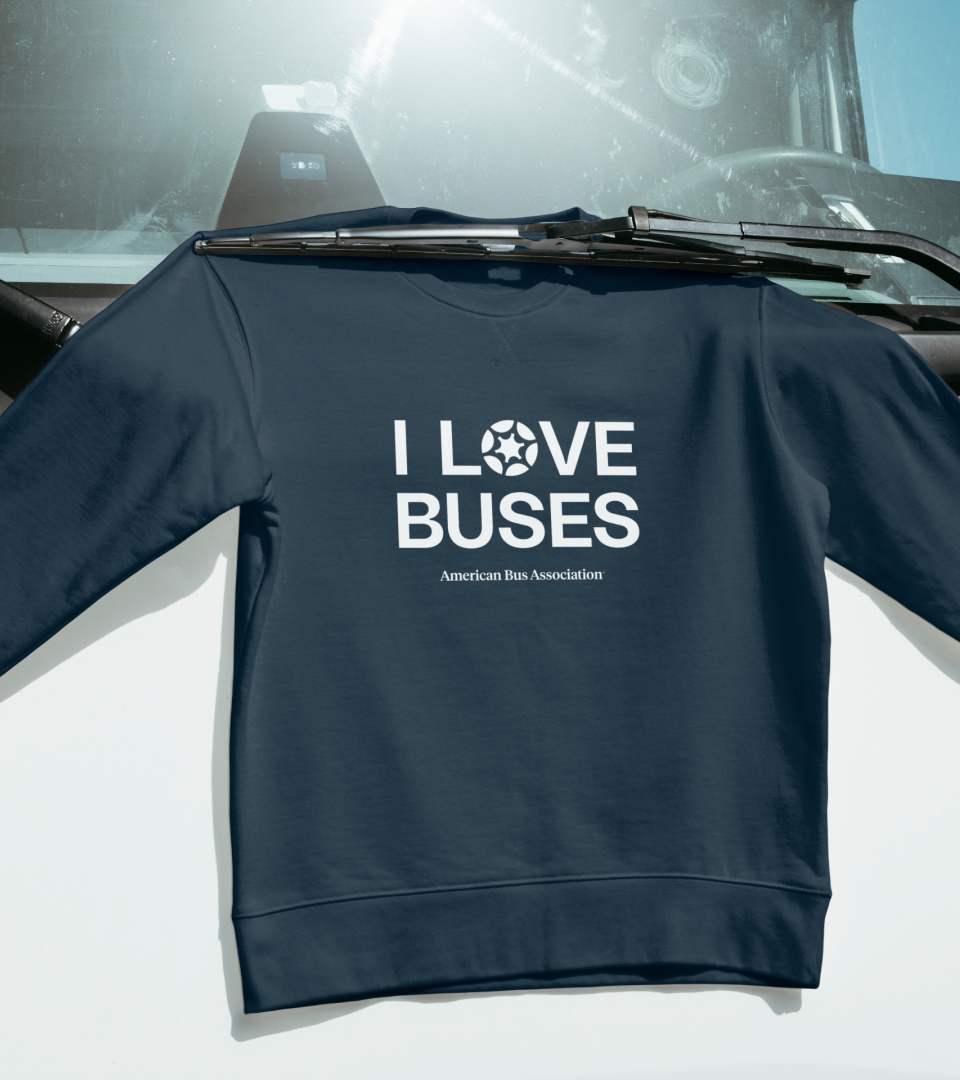
Transportation-inspired forms, a clear sans-serif type system, a refined American-rooted palette, and custom buscapes imagery work together to create a disciplined yet dynamic visual language across all applications.
Art direction
Brand identity
Brand guidelines
Design system
Digital
Web design
Brand strategy:
Copywriting:
Pilot
Project management:
Pilot
Creative direction:
Erik Weikert
Graphic design support:
Bianca Lobodin
Motion:
Bianca Lobodin
Photography:
American Bus Association
Fonts:
Noi Grotesk by Studio Feixen